Thank you all who volunteered to be my muse by voting on which picture I should use as inspiration in my own little design challenge. The winning picture was this tiled doorway.
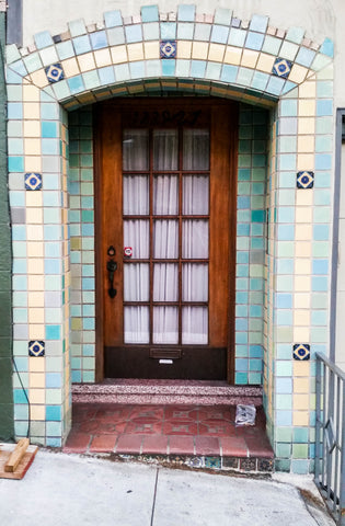
There are so many things that inspire me in this picture. The soft greens, blues and yellows along with the bright wood. The repetitive pattern of the tiles and window panes. The contrast of light and dark.
My first thought was...yay! I've had some cube shaped gems set aside waiting for me to be inspired as to how to use them. This certainly seemed like a good project. Setting them out and contemplating the muse picture I decide to make a necklace. I left the cubes sitting out overnight to "marinate" in the creative center of my brain.
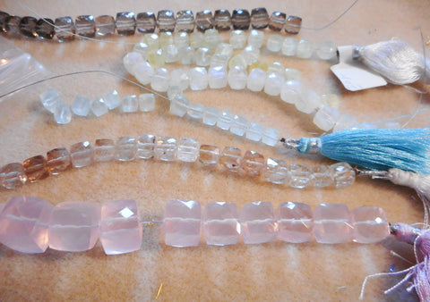
I would certainly use the Aquamarine for the blue and the Prehnite for the green and yellow. I love the Rose Quartz (it makes my heart happy just looking at it!) so I want to find a way to work it in. I'm not so sure about the clear and golden Quartz. The next morning, I clip open the strands and start to play around with them.
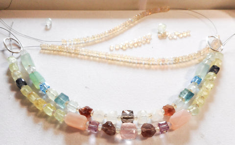
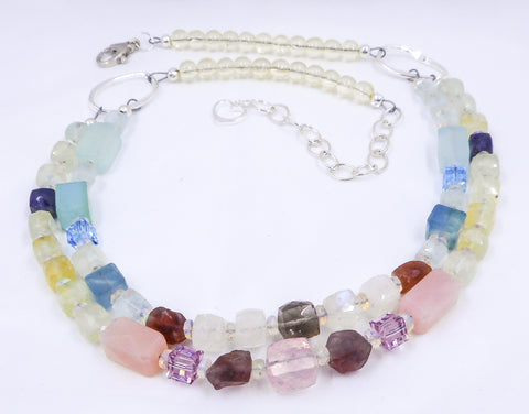
I decide to make the necklace two strands so that one strand can reflect the upper part of the picture and the other will represent the lower part of the photo.
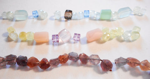
To add in more color for the tiles I include some aqua Chalcedony rectangles, blue Fluorite and aqua Swarovski crystals to reflect the random brighter blue tiles. In looking at the floor in the entry and the color of the wood in the door, I put a Rose Quartz front and center and bring in some of the other colors with pink Chalcedony rectangles, lavender Swarovski crystal and Smoky Quartz. It was beginning to feel too angular and boxy and I didn't feel like I captured the colors in the floor and door enough. I poked around in my stash and found that strand of rough Fluorite nuggets (the bottom strand in the picture above). They were just what I needed for contrast, color and texture. With a few of those added into both the top and the bottom strands, some Moonstone cubes to represent the glass panes... it just felt ... almost right.
I wanted something to space the gems apart a bit and considered using something grey in between them like the tile grout, but my heart kept calling me to the strand of Ethiopian Opals. They would give the necklace a little inner glow which felt like a prettier option to me. One last thing that was missing from this design was the dark blue tiles in the picture. The ones with the white outline inside them. I found some Iolite cubes which are a dark blue violet and put just a couple towards the ends of the bottom strand because they are spaced so far apart in the doorway. I like the way that darker color draws your eyes out to the ends of the strand after they're done soaking in the colors in the center.
At this point the necklace design felt complete. It was just a matter of finishing.
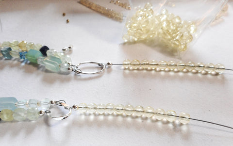
For the sake of comfort, I wanted to taper the two strands down to one and considered sticking with a square or rectangle shape but a joint with right angles at this point would be poking in the neck area. I chose some soft yellow vintage glass round beads to continue that color around the back. Finished it off with a clasp and ta-da! the necklace is complete. I title it "Union" after the street in San Francisco where the tiled doorway is located. I also like the fact that the word union can be defined as "a state of harmony" and also as "the action of being joined", both of which define this process.
What do you think? Does it reflect the original photo? I would love to hear your thoughts and feedback so please leave a comment below.